DEEP DIVE: The Covid "Fudge Factor"
A map of Covid data corruption -- and the Covid approach that worked!
Warning: This newsletter will will hit sacred cows from ALL political tribes when needed.
This post starts by mapping Covid around the world. First, in a “naive” way, taking official data — and then in a smarter way, using “excess mortality”, which also allows us to estimate a “fudge factor” for every country’s Covid data.
Then I draw lessons from the maps — what they say about vaccines, travel bans, lockdowns, and future pandemic responses:
How I started this research — Early media reports misinformed people about US deaths
When the pandemic started, media outlets loved to claim that the US had “the most Covid deaths in the world.”
But they failed to adjust by population! The US is a big country with modern testing, so of course it reported many deaths.
The media left that out and tricked many into thinking that America was uniquely bad on Covid. In fact, adjusting for population showed that America was then doing relatively well among its peers.
Nobody else had mapped out a population-adjusted map, so after being really annoyed about that for a couple weeks, I remembered that I should try to do something about it, and I created Covid19Mapped.com. Here’s what it looked like in May 2020:
At the time, this was the best measure available. Here’s what the same map looks like today:
But there’s a huge problem with this whole method: it assumes accuracy in reporting Covid deaths. Either through corruption, incompetence, or poverty, many countries are surely mis-counting Covid deaths.
Looking at the map, one suspects that, as there are a bunch of real head-scratchers:
— Did Belarus really do the best of any country in continental Europe?
— Did equatorial Africa really have almost no deaths, or did they just not report them?
— Did India, despite being so poor, really outperform almost all developed countries?
— Also, is it possible that the US over-counted Covid cases? This is widely believed in conservative circles, and it’s a fact that, at least occasionally, people were marked as having died of Covid even when it was unrelated.
We can now answer these questions pretty well, on a global scale, using a more reliable method: excess mortality.
A Better Estimate of Covid Death: Excess Mortality
This method is straightforward: Instead of trusting governments to correctly classify and report Covid deaths, take total deaths (all deaths from all causes, not just from Covid) in 2020/2021 and compare that to total death pre-Covid, in 2018/2019.1
The difference is the “excess mortality."
It’s the best estimate of true deaths caused by Covid, because even the most corrupt governments rarely mess with raw death counts. A body is a body, and trying to hide deaths in one’s data leads to population counts becoming inaccurate as well.
So we can trust this measure much more.
It does come with one major caveat: Because it counts ALL deaths, it cannot on its own disentangle deaths caused by Covid itself, impacts from the lockdowns themselves, impacts from vaccines, or unrelated death trends.
But fortunately, there is a lot of global variation in policy and timing that, below, will help us disentangle the different potential causes.
FYI, all below maps go up to Jan 1, 2022, to ensure maximum data coverage and comparability.
Now let’s compare the old and new measures. First, the OLD measure, relying on official government reports of “Covid deaths”:
The new estimate:
[NOTE: The above map goes to the start of 2022 for every country, and is based on the WHO. For a more updated map that pulls from OECD, OWID, and WHO (whichever is most current) see here. The new map goes to the end of 2022, or whatever data is most recent.]
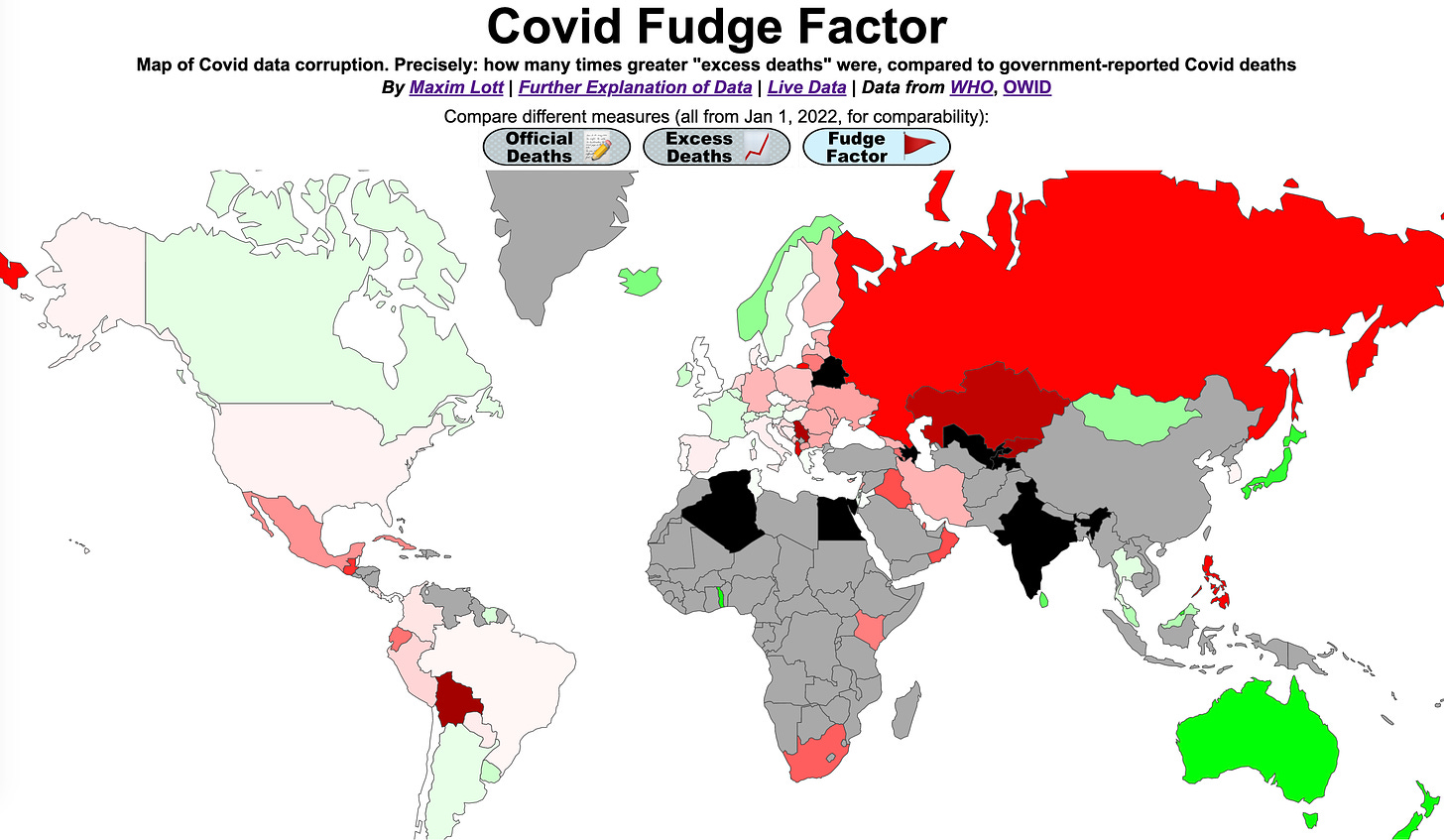
Huge difference! There’s now a lot of black (meaning it’s off-the-charts high.)
Some takeaways:
— Eastern Europe massively under-reported Covid deaths. The map shows that the western countries with more advanced medical systems, less corruption, and higher vaccination rates, did much better. To take one example: Russia reported 2,092 Covid deaths per million people, but suffered 7,390 excess deaths in the Covid era.
Interestingly, awful Covid performance almost precisely traces the line of the old Soviet iron curtain.
I spent 1.5 years in ex-Iron-Curtain countries during the Covid era, and people there acted less concerned about crowded indoor spaces and sneezing — and more concerned about surfaces. And everyone seemed to fear that getting physically cold would lead to colds. That was a longstanding notion in the west, too, but I think now most realize it’s actually not a big factor. In addition, the culture in ex-Iron-Curtain countries places more value on toughness, and less on safety.
Of course, one can argue that more deaths in non-restrictive countries were worth it for more freedom. But first let’s be clear with ourselves that freedom failed to prevent deaths.
— The US death rate was around the global average. Contrary to the view of many conservatives, the deaths probably were caused by Covid itself, and NOT by lockdowns, considering that:
— Australia and New Zealand had many fewer deaths during Covid than pre-Covid, as indicated by green on the map. Their ultra-strict lockdowns may have reduced driving and flu deaths, while also keeping Covid levels minimal. Norway, Japan, and Mongolia kept their net effects to zero; all achieved that with long-lasting near-total travel bans on entering their countries.
— Equatorial Africa really did have low Covid deaths, based on Kenya and Togo. This is largely a result of Africa’s ultra-young population; just 3.4% of Africans are over age 65. Also, obesity in both countries is less than one-quarter of the US obesity rate.
In South Africa, which performed poorly on Covid, 6% are over 65, and their obesity rate is nearly 80% as bad as the US level.
Finally — I think common sense tells us that the numbers in the excess mortality map are far more plausible than those in the map with the official data.
The Covid “Fudge Factor”
Now for my favorite map! We can compare the above two graphs to each other, to estimate how reliable each government’s statistics are, by taking the ratio of officially-reported deaths, to the excess total deaths.
For example, Russia has 3.5 times as many excess deaths than offically-reported ones, so it gets a score of 3.5.
Call it a “fudge factor”:
Takeaways:
— The 7 countries in black have off-the-charts “fudging” of their Covid statistics. Belarus, for example, has a fudge factor of 8.7, which means it had about 8.7 times as many Covid deaths as were officially reported! Perhaps this should not be surprising from a country with a dictator who recommended vodka and saunas to ward off Covid.
Again, fudging largely traces the old Iron Curtain line.
The world record holder is ex-Soviet Tajikistan. It has a fudge factor of 104, meaning it reported 104 times fewer Covid deaths than the excess death data suggest actually occurred.
— In human cost, India is the most important, with a 9.8 fudge factor; while India reported 526,689 Covid deaths, the real number of deaths was more like 5 million.
— Broadly: Eastern Europe, North Africa, and Central Asia have big problems in reporting Covid deaths.
— The US, Western Europe, and most of Latin America did a good job counting Covid deaths. Some may have slightly over-counted, and some slightly under-counted. In the US, the “fudge factor” is 1.13, which means our best guess is that 13% more Covid deaths took place than were officially reported.
For skeptics who can’t believe that deaths were under-counted: both things probably happened. A few cases were wrongly counted, but even more people may have died of Covid at home, without ever getting diagnosed.
— The countries in green may be due to: 1) overcounting, and/or 2) a positive impact, beyond Covid, from lockdowns and social distancing, through things like less driving and fewer flu cases.
In some countries, over-counting cannot be the only factor. In Australia the fudge factor is “-6.32”, which means that for each Covid death they reported, 6.32 times as many people did not die, who would have died in an as-normal pre-Covid era where driving, the flu, or some other death factor, were more prevalent.
Can that be right? Did lockdowns and vaccines in Australia/NZ really work that well?
The above is a troubling conclusion for many of us, who would prefer it if freedom always led to the best outcomes, in all ways.
Let’s dig deeper into the Australia/NZ data, going up to the present day, and make sure we’re confident about what it shows.
One possible concern: those countries have now totally opened up, and Covid has run wild. What if all their brutal lockdowns didn’t save any lives, but merely deferred deaths until the future?
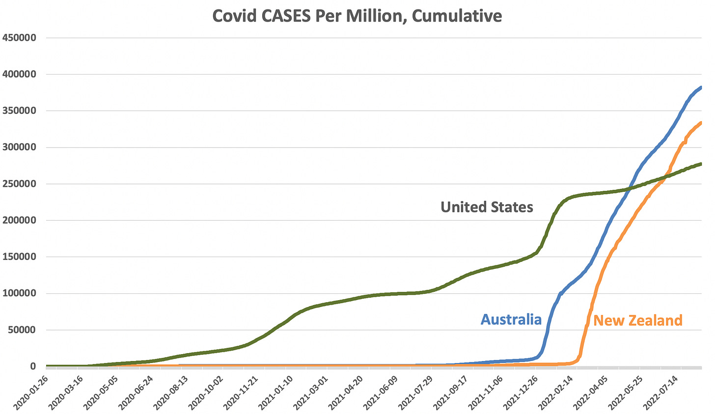
Let’s grab the detailed Australia/NZ data… starting with Covid cases:
You can see that Australia and New Zealand both kept cases to nearly zero until this winter, when they ended their strict rules.
Then when they opened up, cases skyrocketed. All my graphs are cumulative, meaning that both Australia and NZ have now experienced MORE reported Covid cases than the United States. Australia’s policies certainly failed to prevent spread in the long run.
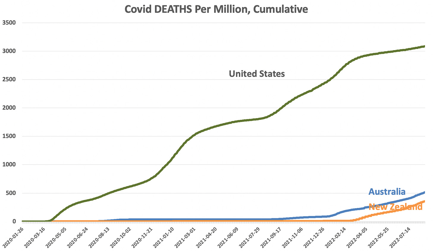
But what do deaths look like?
Australia and NZ saved lots of lives.
By waiting until they were almost fully vaccinated to allow Covid to enter, these countries had just 1/6th, or even less, of the US death rate, even as they have already had more cases. Also, the graph above is population-adjusted, so the lower levels in Australia and NZ are purely due to better outcomes, not because they are smaller countries.
The data are in line with the official ~90% vaccine efficacy in preventing death.
These countries also benefitted from less-deadly strains that had evolved by the time they let Covid spread — however, that is likely be a smaller effect, as studies suggest that Omicron is about 80% as deadly as the original. [CORRECTION, 8/30/22: It showed an 80% reduction in fatality rate, which is almost the opposite of what I had written. This increases the plausibility that it was the weaker strains, moreso than vaccines, which helped these countries. Though, the study conclusion doesn’t fully square with the US death rate remaining fairly high after Omicron: post-omicron deaths account for about a quarter of all US deaths, and about half of US post-omicron cases. That hints at the reduction being around 50%. Thanks to commenter Oskar for noting my error.]
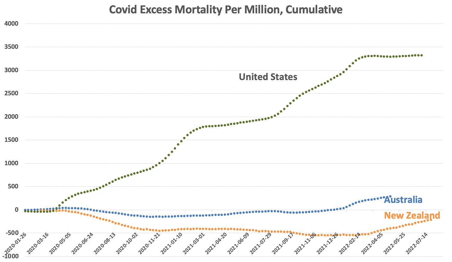
Is it possible that Australia and New Zealand are just fudging their data? Excess mortality indicates, no:
It also shows that vaccine side effects had no visible negative impact on mortality (they were administered in those countries in mid-2021.)
So Australia and New Zealand really do show a near-perfect western response from the perspective of minimizing death (not, of course, from the perspective of freedom from government.)
Were there really fewer non-Covid deaths than normal in Australia/NZ, during lockdowns?
I dug into this. Australia has a great mortality statistics site, which shows that almost every major cause of death fell by 5% or more during the pandemic.
Age-adjusted deaths from heart attacks fell 9%, and deaths from respiratory diseases broadly fell 18%, making a big impact. Suicides fell 6%, driving deaths fell 10%, assault deaths fell 10%, drug deaths fell 4%.
The only significant non-Covid category that rose: Alcohol deaths, up 8%.
It is possible that unintended consequences will cause future rises in deaths. Perhaps heart attacks fell due to people engaging in less strenuous activity during lockdown, but sedentary behavior could lead to worse health in the long run. There is some concern that effects like that are being seen in the UK now, but so far it is not very significant, and could be due to Covid itself having harmed health. We’ll need to wait for more data to be sure.
Did Australia and New Zealand only succeed because they are islands?
Australia and New Zealand do benefit from being isolated. But the difference between an island and a not-island is just a matter of border control. China shows that it is possible for a giant country with many land borders to keep Covid almost entirely out.
The same would not have been possible in many western countries with land borders, as they are kept extremely porous — and there is always strong political resistance to tightening.
Besides islands, the two countries with good data that managed effective travel bans were Mongolia and Norway:
Are Australia and New Zealand just flukes? Adding Mongolia, Norway, and Japan
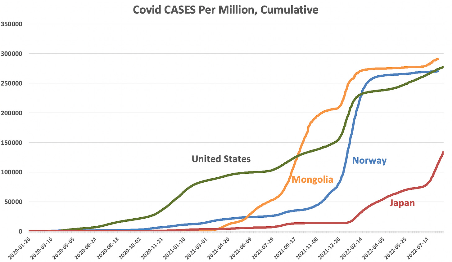
As the maps above showed, a couple other countries almost entirely avoided Covid harm. Let’s zoom in on them, too:
These countries tell fascinating stories. All allowed Covid to enter at different times.
Mongolia, for example, maintained a near-total travel ban from the start of Covid until June 2021, at which point, adults were over 90% vaccinated. As soon as they opened up, cases skyrocketed.
But it was fine:
One reason Mongolia did well is its high vaccination rate. One reason Mongolia did well is its low proportion of elderly people; only 4.2% of Mongolians are over age 65.
However, Norway shows that the same effect can be achieved in a country with lots of old people (17.6% over age 65, compared to 16.5% in the US.)
Norway had near-total vaccine coverage for adults. It reports having 965,742 residents over age 65, and 983,027 people in that age group with a first dose (so, perhaps a few non-residents got one too.)
The graph shows that was effective.
The excess mortality chart isn’t super interesting here. It just confirms that all these “star” countries collect reasonable official data:
But wasn’t the US mostly vaccinated, too? Weren’t many people who died in the US vaccinated?
Zooming in to the US situation, we can see that in highly-vaccinated California during the Omicron wave, for instance, 71 out of every 100 deaths were still occurring among unvaccinated people.
If they had all been vaccinated instead, and IF vaccines were 90% effective, then only 7 of those would have died. In which case, for each 100 deaths that actually happened, you’d instead have 29 + 7 = 36 deaths during Omicron.
That roughly matches the observation that Norway had only 1/3 the death rate as the US, during Omicron.
Cost-Benefit Analysis
How many lives were saved by these “star” countries in the last 2 years, compared to a muddled approach like the one in most of the world? Below, I’ll use the US as an example, and it is also pretty globally-typical:
The US had 3,400 extra deaths per million during the pandemic so far, which works out to 1.1 million total extra deaths.
I then take the age breakdown of Covid deaths, match it with the expected years of life left in each age bracket, and calculate the total years of life lost.
I calculate that 14.5 million years of life were lost in the US due to Covid deaths.
14.5 million years of life lost, divided by a population of 330 million, = 0.04 years of life lost per person = 14.6 days of life lost per person.
This is imperfect because, for instance, people who died were on average less healthy than others in their age groups. Additionally, vaccines can make cases milder, preventing days of suffering. See footnote for a full list of caveats.2
Let’s say the probably range is around 10-to-15 days of life lost, per person, due to the US not following an Australia-like model.
Just to help get our heads around the number: for comparison, I used the same methods to calculate that if all driving deaths could be prevented during a 2-year period, that’d save 3 million years of life, or 3.3 days of life for every person. So, Covid ended about 4 times as much life as driving did in a similar period (it certainly got more than 4x the attention, of course.)
Here’s a question: would you have preferred to live through a total travel ban and total lockdowns, like Australia’s, to save yourself 10-to-15 days of life?
Is stopping that worth it to you?
My personal answer is: No. It would not be worth it to me. I’d take that loss in expected lifespan, in order to travel and live freely for a couple years.
Note that the 10-15 days is the socially-responsible number to consider — it’s calculated from “behind the veil of ignorance,” meaning that it’s assuming that you could just as easily be any person in the population.3
I would not vote for an Australia-like policy, but it’s also reasonable if people in Australia decided that draconian restrictions were worth it to them, to preserve about 2 weeks of life per person.
Let’s now consider the other side of the ledger: the costs to freedom from an all-in anti-Covid approach: anecdotally, it sometimes put people through lots of suffering: sometimes people weren’t able to see loved ones when they were dying, hold funerals, meet friends and loved ones, go to school without double-masking, and so on. However, it must also be noted that suicide rates did not rise — actually they fell.
It must also be noted that the US and most countries in the world also sometimes implemented the above restrictions, but because they weren’t fully committed to keeping Covid out (travel bans) it was not very effective.
Most obnoxious have been the half-hearted rules that make no visible difference in saving lives: forcing preschoolers to mask up while nightclubs are left open, denying life-saving kidney treatment to unvaccinated people despite minimal impact of vaccines on spread, shutting down small businesses while keeping crowded busses operating, etc. Rules like those happened all over the world, and were stupid, unscientific, and cruel.
How about the cost of the serious restrictions to prosperity? Looking at GDP by year, there is no visible correlation between travel bans/lockdowns and GDP. Australia, NZ, and Norway all actually had slightly greater GDP growth from 2020-2022 than the US. Mongolia and Japan did much worse, however. The global data don’t point to a consistent pattern.
Conclusions
— Vaccines worked to prevent death. Really well, and as advertised. They held western death rates down despite elderly and obese populations.
— Lockdowns and restrictions were very effective only when combined with near-total travel bans, and when kept in place until full vaccination.
— It’s not clear that even the most effective anti-Covid restrictions pass a cost-benefit test, when it comes to freedom versus safety (10-15 days added to every life.) Everyone has their own preferences, and we should settle such differences democratically, without censoring and demonizing people.
— Actually answering questions like the ones above (rather than spouting talking points) took a LOT of work! Please consider subscribing, either free or paid, to help me do more deep dives:
Also consider “liking” this post or sharing it. Many of us rightly distrust the medical establishment, but do trust hard data.
Finally, for interactive maps of all the above, see my site: Covid19Mapped.com
That’s how I’d calculate it (just do 2020/21 deaths minus 2018/19 deaths) because I believe there’s value in simplicity. The actual map uses a dataset based on the same logic, but with a more complex model that tries to make a more sophisticated prediction about what cases would have been in 2020/21, beyond just assuming they’d be like 2018/19: https://www.who.int/publications/m/item/methods-for-estimating-the-excess-mortality-associatedwith-the-covid-19-pandemic
Anyway, cross-checking their estimates with the simple way, and some other models (Our World in Data), shows that they’re all pretty similar. I use WHO simply because it has the most coverage.
Another note is that data is extrapolated for some countries. For example, Belarus stopped reporting total mortality data early in the pandemic (they’ve always kept up with the fake Covid-death-data releases, though.) A government dataset leaked going up to March 2021, with the actual total death rate. April - December 2021 are extrapolated by WHO’s methodology.
— A high rate of co-morbidities mean that people who died would have had fewer years remaining than typical people their age, but the extent of that is unclear.
— But if you’re risk- adverse, it’s worse that the average suggests, because outcomes are not evenly distributed; there’s a small chance of dying, and a big chance of no loss.
— A successful Covid response that delayed cases would also have led to milder cases for most people, thus giving back a few days of feeling miserable. Then again, the vaccines themselves also made some people feel miserable for a few days.
If a young person were to calculate it from a selfish perspective instead: it works out to 2.5 days of life lost for a person under 40. (And that’d be even less, for a healthy person under 40.)




Interesting analysis, thanks for looking into it. I am not sure the amount of lifetime gained / lost as an individual is quite the right way to look at the positive side of the ledger, however. You also have to consider the loss of expected lifespan for your friends, parents, children, favourite celebrities, etc.
"would you have preferred to live through a total travel ban and total lockdowns, like Australia’s, to save yourself 10-to-15 days of life? " is a different question than "Here’s a question: would you have preferred to live through a total travel ban and total lockdowns, like Australia’s, to save EVERYONE 10-to-15 days of life? ".
Very great work here.
Is the data available to do an "under 50 excess death"?
I suspect any "Lockdown Related" deaths of despair will be most visible there.
Two nits:
1) It's a disservice to leave out the well-publicized and much maligned control group: Sweden.
2) The number of recorded suicides was lower, but deaths of despair (including overdoses) *skyrocketed* in the US.